These prevalence estimates are historical; their data year is not supplied.
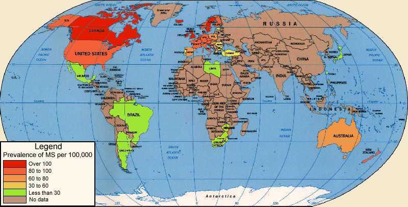
Historical world map of MS prevalence, with no data year supplied. The legend gives people with MS per 100,000: over 100, 80 to 100, 60 to 80, 30 to 60, and less than 30. A separate brown category means no data, not zero cases. Red and orange areas appear in North America, Europe and Australia; green areas include parts of Central and South America, Africa and East Asia. Much of Africa and Asia is brown. These are original historical estimates, not current figures.
Archived image · 2017-07-06

This map is derived from a combination of medline abstracts on MS prevalence and national MS Society estimates. While it is broadly correct, it needs to be updated with new research.

Source details

Author: Paul Jones

Archive capture: . This is not a medical review date.

View archived source